 |
| Tap or click for full size. |

Thursday, February 27, 2020
Tuesday, November 22, 2016
UX exercise : Step 1 - Cropping an image
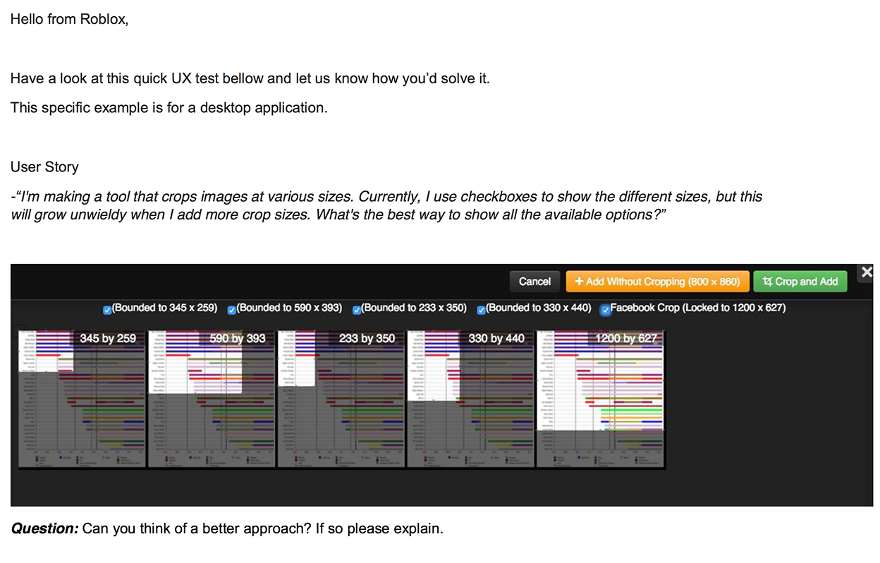 |
| Instructions |
First step : I wanted to give this task some more context. What is surrounding this task, why is the user cropping an image? It was mentioned that we are using a desktop application. I'll assume it might be a program like Photoshop. So, I surrounded the task with an image opened in Photoshop.
 | ||
The Application and Image before the crop...
|

 |
| Accordion opened to a different crop size ... |
 |
| Cropping small images ... |
Tuesday, September 6, 2016
Unity UI : Using CSS to style your Unity games
Unity is lacking an easy method to create and maintain global styles.
This video presents a solution, using CSS to style Unity!
Thanks for taking a look!
Friday, July 22, 2016
Tools : Unity's Editor Transform Widget
Today, a quick one. Simple suggestions for a widget that I use quite a bit.
 |
| Tap or click to view |
Tuesday, July 19, 2016
Product Design : Apple's Next Gadget
Took a little time to think about cool new ideas for the next-generation Apple Watch. Things I would love to see! Mostly morphing ideas that exist together for a great gadget!
 |
| Tap or Click to view. |
 |
| Tap or Click to view. |
Sunday, July 17, 2016
Photoshop - Modal Nightmares!
Photoshop has a great tool called Layer Styles. You can add effects to each layer in your project, this feature has been around for quite awhile. You can also have multiple effects per layer, each effect has values that can be adjusted.
This is one of my most commonly used tools in Photoshop. However, I've been dealing with quite a bit of frustration using this tool.
This tool uses dialogs that are large and cover up my project. Managing this is time confusing and annoying. I'm constantly moving dialogs around to see my project. So, I'm suggesting an improvement that I would love!
First, let me explain my frustration via screen shots :
 |
| Bottom Right : Adding layers styles is easy and intuitive. |
 |
Yikes : When I want to adjust the values for this layer style, the dialog generally covers my project. In this case, completely.
Why do I want to see my project? Because I can see my values adjust the image dynamically. This is super useful.
|
 |
| Wow : I now have two modal dialogs to manage. I have to move both to see my project. |
Note : Larger monitor resolutions can help. Plus, multiple monitors are also very helpful. Credit is also due to Adobe for allowing Photoshop to remember the last position of the dialog.
However, I still find myself dealing with this frustration across different computers. I work with so many different orientations of images which leads to further frustration.
So, I think out-of-the-box we can make this experience cooler!
Let's take a look at some mock-ups that offer improvements :
 |
| Use the whole screen, dim what isn't able to be clicked or tapped. Focused. |
 |
| Still let users move the panels around. Also, have Photoshop remember the last location, maybe per project. |
 |
| Be smart about placement for the color modal dialog, would love recent colors and swatches on here! |
 |
| We better ensure that this works with different Photoshop workspace layouts. The user can customize their UI, moving their toolboxes around - we need to account for that. |
 |
| No matter the workspace layout, always let the user move the dialogs around and remember that preference. |
Overall, seems like a good evolution for Photoshop. One that doesn't completely reboot a legacy UI. The changes wouldn't be jarring for expert users of the product. And quite possibly embraced as improvements ;)
 |
Overview of the suggested changes - Top : Adobe - Below : mine
|
A lot of these ideas are inspired by tablet-based creative apps, ones that have solved similar problems.
Thanks!
Saturday, July 16, 2016


Tuesday, July 12, 2016
Product Ideas : Oculus with AR & VR
Wouldn't it be cooler to have one headset that can morph between the two experiences? The software could detect whether you are in VR or AR mode and adjust accordingly.
Could Magic Leap be working on something like this?
 |
| Tap or Click to see full image. |
Inspirations for this idea came from current treated glass sheets. These sheets allow projections to be displayed and yet still be transparent :
| Current technology allowing transparent reflections. |
Thanks for looking!
Monday, July 11, 2016
Product Design : TV Remote Control
 |
| Tap or Click to explore. |
 |
| Tap or Click to explore. |
 |
| Tap or Click to explore. |
 |
| Tap or Click to explore. |
Sunday, May 15, 2016
Apple Predictions : Edge-to-Edge screen and android buttons
Saw this new concept of what the new iPhone is rumored to be : Mac rumors Link
 |
| Agree with the edge-to-edge screen, but I see buttons along the bottom. |
This concept is quite beautiful, the ability to touch the screen to unlock is the obvious evolution for this product.
I'm wagering this transparent fingerprint sensor isn't affordable yet. A company has announced the ability to perform this task with a transparent sensor, but i don't see that for the masses in the next release. In the future, absolutely! but not this year.
I'm wagering this transparent fingerprint sensor isn't affordable yet. A company has announced the ability to perform this task with a transparent sensor, but i don't see that for the masses in the next release. In the future, absolutely! but not this year.

Apple isn't going to move away from that method to unlock your phone. It is also the method used to complete a purchase with Apple Pay.
Also, I feel that Apple is going to throw in the towel and finally adopt the superior back button from Android.
 |
| Will have physical buttons along the bottom, and fingerprint recognition. |
iOS UX : Switching between custom keyboards
A friend of mine just released a custom keyboard called Muggie. This keyboard offers a great method to share recorded GIF animations, quickly.
While playing with Muggie and attempting to switch to another keyboard, trouble arose. Switching between custom keyboards was confusing. When you have more than two it is quite laborious to get from one keyboard to another intended one.
I wondered if there was a better method to switch between keyboards.


Note : Got a great comment about whether the swipe would result in keys being tapped. Would this solution not work when implemented on the phone?
Before posting the idea, I played around with 'swipe' based keyboards and also the Apple default one. I was able to simulate a hard/force swipe from the edge that didn't result in keys being tapped. I tested this quite a bit with satisfactory results.
However, Apple would have to detect a tap that originated from the right or left edge of the keyboard. It would then have to continue at lease 1/3 of the distance across the screen. Only then would the user get the hint of the other keyboard coming in from the side to overtake the existing one.
Saturday, April 2, 2016
Safety : CalTrain Indicator

A coworker was telling me that the yellow line at CalTrain is a lot more important than we might think. If a person was to stand inside of the two yellow lines, the air pressure of a passing train might actually pull them into the train. This is an extremely dangerous situation, in-fact life threatening.

The painted lines provide some confusion, why are there two of them? Why are they both yellow? Which yellow line is being mentioned to stand behind? What exactly does behind mean? What if you don't read English?
This is a pretty simple concept and most people get it. However, when safety is involved it can never be clear enough. This is an interface in-between people and possible danger.
Let's consider the user for this situation. When designing computer interfaces, you assume the person is able to turn-on a computer, and they can execute your application or content.
For a train station you must assume very little. The person consuming this interface might not even be a passenger, they might be a vagrant. How would even a small form of ambiguity affect a person with thought disorders, schizophrenia for example? Could a small child wander close to this danger? Could the person be illiterate? Could this interface be so clear that even animals could consume it?
How could it be improved?

Wouldn't it be cooler if there was only one yellow line? Let's make the other line red, as you would assume it is even more dangerous to stand in proximity of that.
The platform affords that you stand on it. You stand while you wait for the train. Could we use a visual cue to show where?
Some simple improvements could make this a better interface.
Sunday, November 22, 2015
Thoughts on VR-gaming in 2016
A List recently had a good article about Nvidia and Virtual Reality. [ link ]
It was quite interesting and feels like 2016 is going to be a critical year for gaming-VR. A lot of releases are scheduled for just Q1.
It was quite interesting and feels like 2016 is going to be a critical year for gaming-VR. A lot of releases are scheduled for just Q1.
Content might be the big winner. Let me elaborate :
 |
| Stereoscopy has been around for quite awhile. |
We are going to have plenty of flavors of VR-devices doing essentially the same thing - displaying 3D-images 2 inches in front of our eyes. Quite similar to stereoscopy devices that have been around for quite awhile. These devices will use different hardware-schemes to render the 3D images for content.
- Some will use high-end PCs that have minimum-specs to be compatible. The VR goggles will be connected to the PC video card. Cables will be required between the HD video stream and the googles.
- Some will use goggles that are just shells that surround smart phones. These will be more ubiquitous, but will have a lower-fidelity experience. However, modern smart phones have the necessary equipment to provide a compelling VR experience.
- Some will embed hardware within the goggles, but will have higher-priced entry points for the devices. These self contained units will provide a specialized experience and won't need cables or other equipment.
Most will converge around a common controller scheme. The input method will resemble the interface between a console and a controller. Basically consisting of trigger buttons and movement controls.
They will also converge around common game development tools like Unreal and Unity. Existing studios are already geared-up to make VR games, look for a lot of familiar studios making VR content.
The VR hardware battle is brewing to be a tight race, much like BlueRay versus HD-DVD. The big players are going to spend quite a bit of money attempting to become the standard for VR gaming.
I predict Oculus is going to take the early lead. Taking the win with the premium experience. Adopters will be those willing to spend over $1000 for a PC capable of driving the Oculus, or ones that already have a gaming-PC. A small amount of people that have the high-end Samsung phones will also adopt. I'm not sure if this lead will be a win for Oculus? They are going to spend an enormous amount of Facebook money for this early lead.
Microsoft, Carl Zeiss, Google Cardboard, Nvidia, Sony and others will need to focus on bringing a premium experience to rest of the market. Consisting of the 472 million iPhones that have been sold and the world of computers that don't meet Oculus specs or Macs. However, these guys are behind the battle on how you control the game, they are also still struggling with just the visual experience.
Samsung sells more phones globally than Apple, but how many of those international customers are going to rush out and buy a $200+ accessory to play VR games developed for a Western audience? I predict lower sales for Samsung VR units than the market might expect.
A break-out hardware leader might bring a premium VR experience to existing consoles. ( Xbox and PS4 )
Sony is laying down that gauntlet with their PS4 'Morpheus' project. After watching the promo video, it just reenforced that these VR devices are just : ( a phone screen - two plastic lenses - and a gyro ).
Sony Morpheus VR is just 1080p resolution and only a 100 degree viewing area. Smartphones push that many pixels and a larger viewing area...
With a name like Morpheus, I expected quite a bit more. Also, just imagine the umbilical cord from your console to your couch? Unless someone has a wireless method to bring 120-FPS 4k video between those, the experience is broken for the mass-market.
While the hardware battle ensues, studios with great game ideas and experiences for VR have an amazing opportunity to capitalize upon.
I feel the content providers have a great chance to win in the VR game.
Studios that develop engaging games that work across this hardware have a great chance of solid revenue and a market foothold. Whichever flavor of VR you have adopted, they will have quality games to play and share with your friends.
The content race won't be about exclusive titles. These will be funded by the big VR players, but are really just designed to sell hardware.
Successful content also won't be about pushing the most polygons and pixels to your VR device. Content should bring unique experiences that unleash the immersive power of VR. I'm much more excited to see games like Monument Valley in VR, versus Grand Theft Auto in VR. Think more like Myst, and less like Call-Of-Duty ... VR edition.
I want the market to bring break-out games to VR, I'm excited to see game-changers. They will be the big winners, while the VR-hardware battles tight margins and lower than expected adoption.
Most importantly, bring content across all the flavors of VR hardware.
What about the other side to VR? Watching movies through your 3D device? Netflix for VR? I'm not convinced the mass market wants to watch movies that way. Do parents really want their children to jack-in and sit mindlessly on the couch? Is human-interaction while watching a movie that important?
Is your significant-other going to be supportive of your nightly 2+ hours of jacking-in time?
Do you want to bring your VR device into the bedroom? Jacked-in while your partner sleeps?
If watching movies with VR becomes a popular pass-time, I'll vote for the device to come with 'popcorn-mode' so I can see my snacks.
Saturday, November 14, 2015
Human-Robot interaction : Tesla making a right turn
Sooner than we might expect, autonomous cars will be navigating our cities, and drivers will transition to passengers, paying minimal attention to traffic. I even envision a future without driver seats, with occupants of autonomous cars gathered around a table, engaged in social interaction.
However, what about the dynamics between drivers, pedestrians, and cyclists? This interaction demands mutual awareness; a lack of it could lead to hazardous outcomes.
I'm particularly vigilant about establishing eye contact with drivers, essentially using it as my 'interface' when crossing a street, especially during a right turn on red. Trusting that a driver will glance in my direction before accelerating through the turn is something I can't risk.
  |
Ensuring safety dictates the importance of establishing eye contact with a driver before stepping in front of a vehicle. But how does one accomplish this with an autonomous car? While current autonomous vehicles are equipped with sensors to prevent accidents, if one were to walk in front of them at just the right moment, it could trigger a sudden reaction from the car. After accelerating for a turn, the vehicle might abruptly stop, alarming pedestrians and passengers alike. Such an experience would be better avoided. Consider also the scenario where someone stands behind a street pole, out of view of the autonomous car's sensors. Upon stepping out to cross the street, assuming the car detects them, the vehicle won't hit them, but the sudden reaction could still be startling. The ability to make right turns at a red light is essential for traffic flow but demands careful safety checks by human drivers. I have a simple idea that could enhance safety and streamline this process for autonomous cars. |


How about a simple light that tells the pedestrian what the car is sensing?
 |
Red light = I'm an autonomous car, but I don't see you. So, I think it's okay to make a turn! Wouldn't it be more effective to incorporate a bright light on autonomous cars to indicate their intent? Pedestrians could then focus on this light, akin to making eye contact with a human driver. Positioning this light near where eye contact would have been. A green light would signal to pedestrians that they're seen by the car and can proceed. If the light turns bright red, it alerts pedestrians to use caution, indicating that the car doesn't detect them. This approach eliminates guesswork and transparently communicates the AI's decision-making process.
However, what about blind individuals? They wouldn't see this light. Perhaps a safety sensor could be implemented to detect a high-pitched sound, informing the blind whether it's safe to proceed or not. The autonomous car emits a sound as an indication of its current intent. |
Friday, November 13, 2015
App UI : iPad Pro and Anki OverDrive
For this posting, I would like to talk about my thoughts on designing for 'edge-cases'. I'm suggesting a fix that might be considered an edge-case. This is a product for younger children, in particular young boys.
How many children are going to have an expensive iPad pro, iPad Air 2, samsung Galaxy View or another larger device?
For edge-cases like this, I still like to produce design solutions that solve for all.
However these suggestions would need to consider against larger issues that might offer more value to be addressed. For example, the battery life of the cars might be a much larger issue? During games, your car battery will die during a battle, which is quite disruptive.

UX suggestions for larger screens ( iPad Pro - Samsung - etc )
A lot games are going to have to consider making alternative UI schemes for the new larger devices. Games and RC control UI generally utilize the entire screen. Including products like parrot drone, sphero, bb-8 and even a company I used to work for Anki. I’m going to suggest solutions that would improve the experience for my former company and products - Anki OverDrive and Drive.
OverDrive is amazing fun, I highly recommend giving it a try :)

The iPad Pro weighs over 1 pound and has a large screen. Users will rest the weight of the device on their thighs, and they will sit down more. This is much different than playing with a lightweight phone.
In Anki OverDrive Lane-switching is done by rotating the device, using the gyros. This will be fatiguing and should be re-thought, or at least be an option you can disable/enable.
You also tap the buttons hundreds of times per game and the distance between them will fatigue your hands.

Wouldn’t it be cooler to let the player tap their controls where they want them? With less distance for thumb travel needed?
Where they tap is where the UI mounts, the UI could be moved by tapping in a new location, it is dynamic and you control the placement.
I see much less hand fatigue and a much better gameplay experience. Could you imagine the thumb fatigue with the old UI?

This orientation also allows for less accidental ‘home’ button presses. Accidentally pressing the ‘home’ button closes the app!
It also doesn’t cover the 4 speakers for better sound presence. When your hands cover the speakers it mutes the sound, a big part of this game is the sound feedback.

Subscribe to:
Posts (Atom)